As a frontend engineer, you’re always on the lookout for ways to make your app more engaging and visually appealing. One simple yet effective way to achieve this is by incorporating CSS animations into your designs. Small, interactive transformations, such as hover effects on links or buttons, can give your app a unique and memorable touch. These effects can involve changes in color, size, rotation, borders, and more.
In this blog post, we’ve curated a collection of outstanding hover effects for links to inspire your next project. Check out our top picks below and read on for a brief description of each effect!
1. Underline Slide
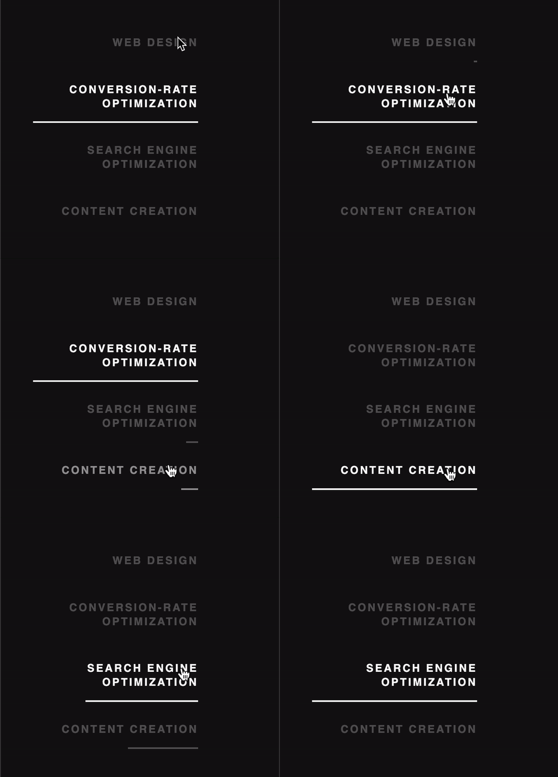
Underline Slide features a sleek, sliding underline that appears when a user hovers over a link. It’s a subtle yet modern approach that adds a touch of sophistication to your website.
2. Color Fill
The Color Fill effect gradually fills the background of the text with a specified color when the user hovers over it. This effect can make your links pop, drawing attention to meaningful calls to action.

3. Strikethrough
Strikethrough is a CSS property that makes text look as though it has been struck through, like this. In web development and writing, this is frequently used to denote that text has been erased or is no longer relevant, but it can also be used for link animation.

4. Underlined Expanded Color Fill
Yet another Color Fill example where the background of the text is filled with specified color from bottom to top, with a bit of expansion in the process. This visual effect makes it easier to grab visitors’ attention and highlights important links with calls-to-action.

5. Heartbeat
Enhance your links with the Heartbeat effect. When a user hovers over a link, a text smoothly expands to grab their attention. This effect would be the perfect complement to your app.

6. Border Expansion I
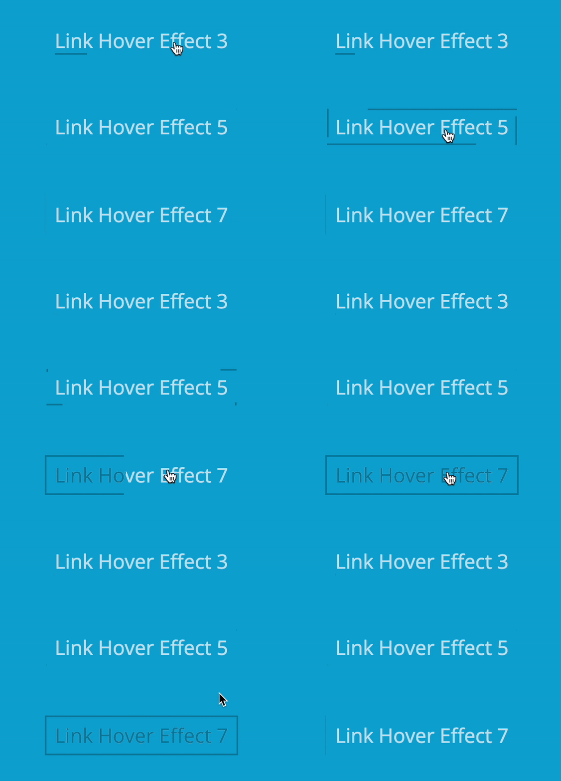
Add some flair to your links with the Border expansion effect. When a user hovers over a link, a playful, undulating border appears around the text, adding a touch of whimsy to your website.
7. Sliding Border
The Sliding border effect adds depth and dimension to your links. Upon hovering, a border appears around the text, giving it a slight 3D appearance.
8. Border Expansion II
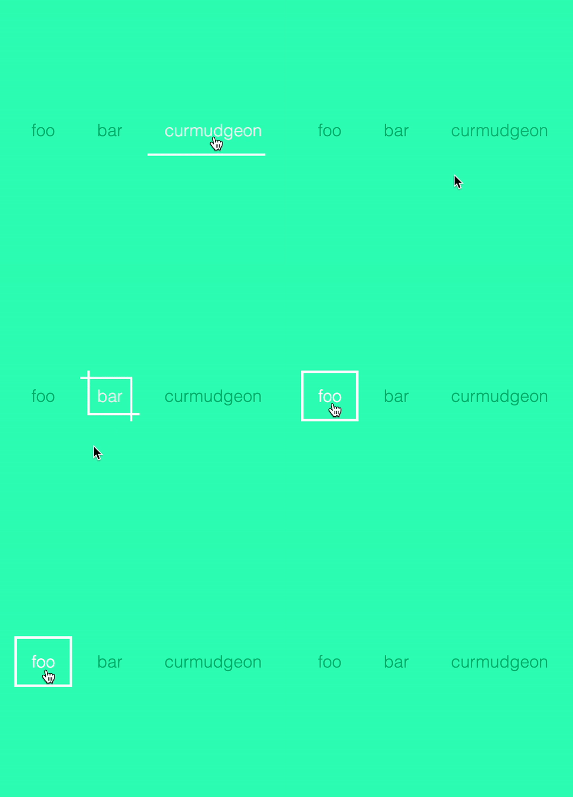
Make your links stand out by adding a border that expands outwards when a user hovers over the text with Border Expansion. It’s an excellent way to draw attention to difference-making links or buttons.
9. Border and Background Slide
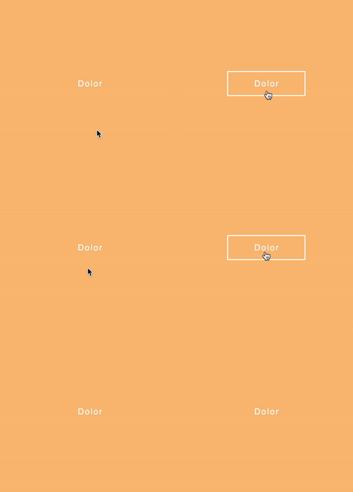
The Border and background slide effect creates a smooth sliding animation when a user hovers over a link, revealing a colored background that slides in behind the text. It’s a stylish and modern approach to link hover effects.
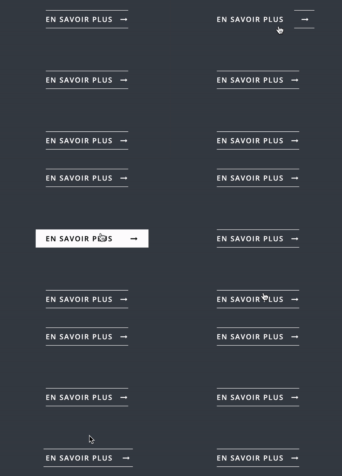
10. Ripple Effect
Add a mesmerizing touch to your links with Ripple Effect. When a user hovers over a link, a circular ripple expands from the cursor’s point of contact, creating a fluid and eye-catching animation.

Tips for Implementing Hover Effects
- Consistency: Ensure that the hover effects you choose align with your app’s overall design and theme. Consistency is key to maintaining a cohesive user experience.
- Accessibility: Make sure your hover effects don’t compromise the accessibility of your app. Keep in mind that some users may be navigating your site using assistive technologies, and not all devices support hover interactions.
- Performance: While hover effects can add visual interest to your app, it’s crucial not to overload your site with too many animations that may affect performance. Keep the number of effects to a minimum and optimize the code for efficiency.
- Responsiveness: Ensure that your hover effects work seamlessly across different devices and screen sizes. Test your effects on various platforms to guarantee a smooth and responsive user experience.
- Customization: Don’t be afraid to tweak the hover effects to suit your app’s unique style and branding. Experiment with colors, sizes, and animations to create a personalized experience for your users.
Conclusion
Incorporating CSS hover animations and transitions into your app can significantly enhance its interactivity, engagement, and overall user experience. Not only do these effects provide valuable visual feedback to your visitors, but they also encourage users to take desired actions on your site. The best part? You don’t need to be an HTML & CSS expert to create impressive animations. A basic understanding of these technologies is sufficient to get started on crafting eye-catching hover effects for your app.
Now that you’re armed with a selection of stunning hover effects and some tips for implementation, it’s time to elevate your app’s design and make your links more engaging than ever before. Happy coding!
About Author
Aleksandar Beronja is a frontend-based software engineer, with extensive expertise in engineering and sports. He proficiently speaks React, Angular, and React Native. Immersed in code-writing for visually stunning and unique solutions, Aleksandar is one of the brightest MVP Marbles out there.
